Sunday, December 31, 2006

Winston Wolfs Photoblog

A nice way to present pictures online can be found on the site of polish photographer Winston Wolf, which I recently stumbled upon. Not only are the pictures stunning, but I particulary liked the presentation, the way the images are framed. He allows a lot of space for them to breathe and it still feels very elegant, he uses tiny details to make it look very attractive like the thin hairlines in the background of the outer frame and the subtle gradients.

He also makes perfect use of the interactive nature of the web by letting visitors comment on the pictures and let them rate them.

Have a look here:
http://winstonwolf.pl/

Saturday, December 30, 2006

Warhol-Style Selfmade

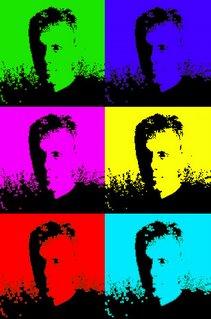
After having a look on some of the famous Andy Warhol works, the colourized portraits which have become a symbol of pop art and have been copied in every thinkable way. (Just have a look at my post some time ago), I got the idea to do something similar with a portrait of myself.

The steps are quite simple:
  • First you need a good picture with sufficient contrast and if possible a rather plain background.
  • Next step is to convert it into a simple black and white image, I used the photoshop function Image -> Treshold. You have to experiment a bit with the value in order to get a recognizable result
  • Then comes the fun part to play around - colourize the pictures. In this case I decided just to use one colour for one picture and leave the outlines black.
And thats it:

Wednesday, December 20, 2006

Wall Art

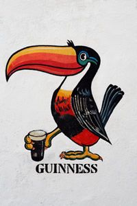
The tucan has been used for decades by the Irish brewery Guinness for advertising.

I wonder who had the strange idea to use such an exotic bird conjuction with an old Irish stout beer?? But anyway it proved to be very succesful and the old and new enamel plates featuring the bird are on sale everywhere in the country. I took this picture which was painted on a wall (about 2*3 meters in dimension) somewhere in Galway.
In South America you find Ché on the walls, in Ireland a beer drinking bird...funny...
I really like the colours and the detail of the painting. It just looks so friendly, elegant and inviting.
(Well I don't have to mention that I also love their products, right?)

Social welfare poster

I wanted to create a poster to raise awareness of hunger. In the our western affluent society and among the upper class everywhere in the world, people tend to spend enormous amounts of money on hairdressing, personal trainer and exquisite food for their pets while thousands of their fellow citizens suffer of starvation.

The poster is very minimalistic, with just one image and it doesn't work without the text. I directed it to a rather educated audience. I wanted to make people think, not shock them with a gruesome image of an african child, which we all have in mind thinking of the topic.

It doesn't tell you exactly what to do, but it delivers some "food of thought". Here it is...
Wednesday, December 13, 2006

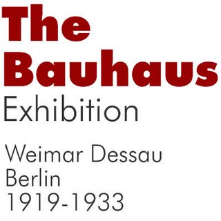
Futura research

I collected some important data about the Futura font, which I am going to present in my next assignment.
  • serif-less, very geometric forms, based on triangle, square and circle
  • long ascenders and even strokes
  • created in 1927 in Germany by Paul Renner
  • Inspired by the Bauhaus style
  • font family consists of over 40 different styles
  • Very popular in the 20th century, especially in the 50 and 60s
  • Priced at over 500U$ for the whole family
  • Famous companies use it in their coprorate design
    • Volkswagen
    • German Railways
    • Ikea
    • Union Pacific


Sources:

Warhol & Cannabis

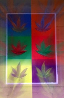
This was made from a poster I had hanging in my room back in those teenage days...The pop-art style and the arrangement are clearly Andy Warhol style which have been copied a lot of times. This one features cannabis leaves...

I mounted my camera on a tripod and did some experiments with zooming in during exposure. (you have to be quick!) This can create an interesting effect, it looks as if the leaves come flying out of the picture which is kind of supporting the topic...

I also wanted the image to look less photographic, less sterile so I used some filters on it to roughen it up a bit and made it more look like a painting.

Saturday, December 09, 2006

Aging photos

Last weekend I got a shot of fishermen coming home from work in the early morning near Mui Ne.

With their traditional boats; this picture could as well have been taken 50 years ago. So I had the idea to age my photo and make it look really old. I first took out the colour, applied a sepia tone and tried out tools to bleach it and brushes to make it look worn out and a little damaged.
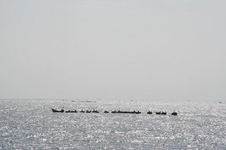
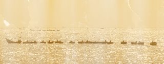
Here is the original:


And the aged version (better to enlarge it)

Self Portrait as machine

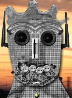
For my first graphical assignment I tried to include many different characteristics and references to myself and my life in the portrait, you probably won't recognize all of them unless you know me really well.

The machine's face is very human in shape and actually resembles the outlines of myself. The same goes for the proportions, eyes and eyebrows are dominating in both my real picture and in the machine.
Other things are more subtle, all the "materials" used have some significance for me. I decided not to stick to one theme, but used different raw materials for the collage, ranging from cameras to fry pans to bicycle gears.