Layout excercise
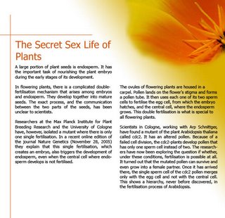
So that’s my attempt to layout the "Secret sex life of plants"
I tried to keep the layout simple, so I just used one image, experimented with more in the lower page, but skipped it eventually
The gestalt concept of continuance is used with the lines to guide the viewer towards the main image.
Closure can be found in the upper left corner, the quarter image of the flower.
As for typography I used the Font Futura, which I think looks quite elegant, still appropriate for the scientific content. Two columns and justification, as often used in magazines make it easy to read.


1 Comments:
This worked out subtle and very clean. I only wonder if you really need those two lines there at all?
Post a Comment
<< Home