Saturday, January 13, 2007

Title sequence for "Un chien andalou"

Well, the semester is almost over, and this is my final assignment for Electronic Imaging and Design. I chose to create a title sequence for the famous surrealist film "Un chien andalou", created by Salvador Dali and Luis Bunuel which I found most impressing.

The sequences of apparently senselessly connected scenes which appeared in the dreams of directors Dali and Bunuel are sometimes horrifying, crazy and even funny. Many people tried themselves to analyze this short film and draw conclusions out of the pictures but I doubt this is possible...which could be the artist's intention.

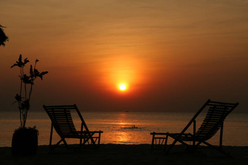
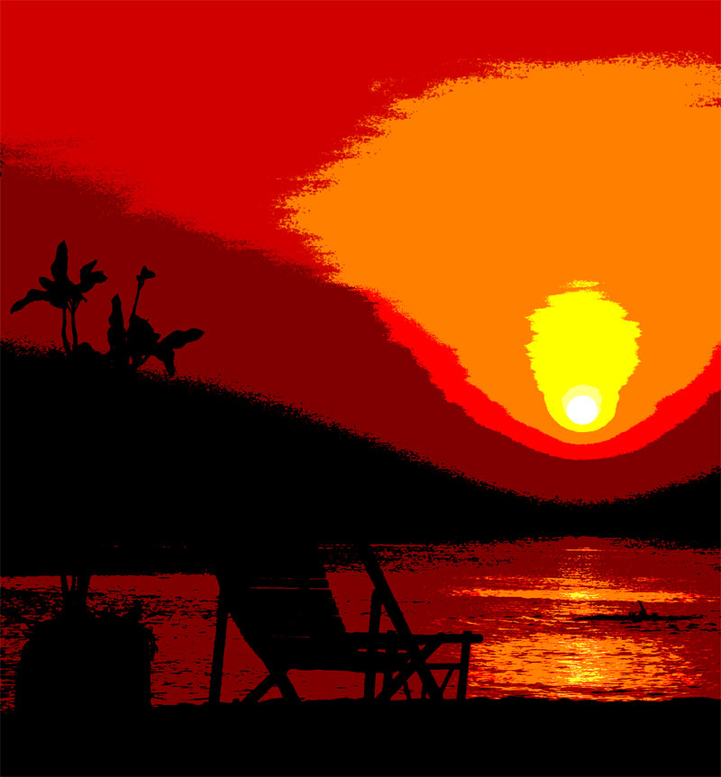
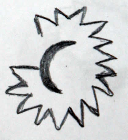
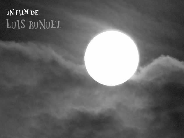
I took the element of the moon, which appears in the beginning of the 17-minute film and build my short title sequence upon that. I wanted to create a dream-like sequence, so I chose to do it in a slow pace, with some classical lullaby music and a font that matches the theme.

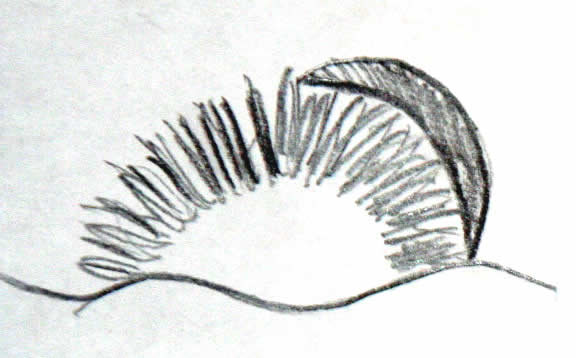
The title sequence ends with a zoom out of someone's eye, which is a reference to a key scene in the movie and also to show that everything could be unreal, be just a dream.

Have a look here:

Abstract sunset

I recently played around with some photos I took on Phu Quoc Island. The sunset there is stunning, and you can really get some very nice pictures....Well..the usual, "romantic" and a bit kitschy photographs everybody knows.

I wanted to create a more dramatic, less photographic image out of that, and Photoshop offers some nice tools to reduce details and merge similar tonal levels, so after a while I got a colour-reduced picture with detailed outlines of the foreground and a dramatic, simlified background.

This is the original photograph:


This is obviously the cropped and modified version of the sunset

Sunday, January 07, 2007

Max Ernst

I'd like to present you a few works of the german surrealist painter Max Ernst I found quite interesting. Ernst was born in 1891 and began studying philosophy, literature, art history, psychology and psychiatry.

He survived two world wars, married three times, lived in Germany, France and the United States and produced more than 80 significant works before his dead in 1976.


This one is titled "The triumph of surealism" and was made in 1937. I find this one especially powerful. The creature, half man, half beast could be originated form your worst nightmares.


This one his one of his earlier works, form 1023 and is called "Ubu-The imperator". It somehow strongly reminds me of another picture I have seen before, but I can't get the connection...

I like the way he mixes realistic, human elements with fantasy styles and non-organic patterns, and it still feels so fluent

Sources:
http://en.wikipedia.org/wiki/Max_Ernst
http://www.allposters.com/

Friday, January 05, 2007

"Web 2.0" Headers

I am sure you have already stumbeled upon this new header style, normally used with a webaddress, with this shiny, polished look, the bright colours and the mirroring.

This style has become quite popular recently and is often associated with the buzzword of Web 2.0 applications.

Although I am not the biggest fan of this new style I wanted to try it out for myself, and well, here is the result:


Have a look here for the Photoshop tutorial.

Sunday, December 31, 2006

Winston Wolfs Photoblog

A nice way to present pictures online can be found on the site of polish photographer Winston Wolf, which I recently stumbled upon. Not only are the pictures stunning, but I particulary liked the presentation, the way the images are framed. He allows a lot of space for them to breathe and it still feels very elegant, he uses tiny details to make it look very attractive like the thin hairlines in the background of the outer frame and the subtle gradients.

He also makes perfect use of the interactive nature of the web by letting visitors comment on the pictures and let them rate them.

Have a look here:
http://winstonwolf.pl/

Saturday, December 30, 2006

Warhol-Style Selfmade

After having a look on some of the famous Andy Warhol works, the colourized portraits which have become a symbol of pop art and have been copied in every thinkable way. (Just have a look at my post some time ago), I got the idea to do something similar with a portrait of myself.

The steps are quite simple:
  • First you need a good picture with sufficient contrast and if possible a rather plain background.
  • Next step is to convert it into a simple black and white image, I used the photoshop function Image -> Treshold. You have to experiment a bit with the value in order to get a recognizable result
  • Then comes the fun part to play around - colourize the pictures. In this case I decided just to use one colour for one picture and leave the outlines black.
And thats it:

Wednesday, December 20, 2006

Wall Art

The tucan has been used for decades by the Irish brewery Guinness for advertising.

I wonder who had the strange idea to use such an exotic bird conjuction with an old Irish stout beer?? But anyway it proved to be very succesful and the old and new enamel plates featuring the bird are on sale everywhere in the country. I took this picture which was painted on a wall (about 2*3 meters in dimension) somewhere in Galway.
In South America you find Ché on the walls, in Ireland a beer drinking bird...funny...
I really like the colours and the detail of the painting. It just looks so friendly, elegant and inviting.
(Well I don't have to mention that I also love their products, right?)

Social welfare poster

I wanted to create a poster to raise awareness of hunger. In the our western affluent society and among the upper class everywhere in the world, people tend to spend enormous amounts of money on hairdressing, personal trainer and exquisite food for their pets while thousands of their fellow citizens suffer of starvation.

The poster is very minimalistic, with just one image and it doesn't work without the text. I directed it to a rather educated audience. I wanted to make people think, not shock them with a gruesome image of an african child, which we all have in mind thinking of the topic.

It doesn't tell you exactly what to do, but it delivers some "food of thought". Here it is...

Wednesday, December 13, 2006

Futura research

I collected some important data about the Futura font, which I am going to present in my next assignment.
  • serif-less, very geometric forms, based on triangle, square and circle
  • long ascenders and even strokes
  • created in 1927 in Germany by Paul Renner
  • Inspired by the Bauhaus style
  • font family consists of over 40 different styles
  • Very popular in the 20th century, especially in the 50 and 60s
  • Priced at over 500U$ for the whole family
  • Famous companies use it in their coprorate design
    • Volkswagen
    • German Railways
    • Ikea
    • Union Pacific


Sources:

Warhol & Cannabis

This was made from a poster I had hanging in my room back in those teenage days...The pop-art style and the arrangement are clearly Andy Warhol style which have been copied a lot of times. This one features cannabis leaves...

I mounted my camera on a tripod and did some experiments with zooming in during exposure. (you have to be quick!) This can create an interesting effect, it looks as if the leaves come flying out of the picture which is kind of supporting the topic...

I also wanted the image to look less photographic, less sterile so I used some filters on it to roughen it up a bit and made it more look like a painting.

Saturday, December 09, 2006

Aging photos

Last weekend I got a shot of fishermen coming home from work in the early morning near Mui Ne.

With their traditional boats; this picture could as well have been taken 50 years ago. So I had the idea to age my photo and make it look really old. I first took out the colour, applied a sepia tone and tried out tools to bleach it and brushes to make it look worn out and a little damaged.

Here is the original:


And the aged version (better to enlarge it)

Self Portrait as machine

For my first graphical assignment I tried to include many different characteristics and references to myself and my life in the portrait, you probably won't recognize all of them unless you know me really well.

The machine's face is very human in shape and actually resembles the outlines of myself. The same goes for the proportions, eyes and eyebrows are dominating in both my real picture and in the machine.
Other things are more subtle, all the "materials" used have some significance for me. I decided not to stick to one theme, but used different raw materials for the collage, ranging from cameras to fry pans to bicycle gears.


Thursday, November 30, 2006

Full motion

Sport events are great to capture a moments full of motion.
At today's match I played around with very high shutter speeds of 1/16000 and less to freeze such a moment.

I got one image I'm quite satisfied with, you can actually see some details you normally would not notice, such as the raising dust after a strong shot.

I also cropped the image to a stronger landscape format to emphasize the direction everything seems to move.

Header Image - Swiss Club

Some international students think of establishing an international Club at RMIT, which is supported by the Swiss Government I designed a header image for the use on the website.(which still to come)

As the corporate Design of official Swiss information material is quite minimalist, and scarcely uses much colour, mostly grey and black, I tried to transfer that philosophy to my work.

The image in the background is a subtle outline of the Matterhorn, maybe the most famous mountain in Switzerland. I used a rather weak, distorted line to contrast with the strong, upright letters of the text.

Sunday, November 26, 2006

Business Card

As the vietnamese are really fond of exchanging business cards, I had the idea do design one myself.
I wanted the style to match my new website portfolio (see post below), so I used the same colours, fonts and patterns as for the website, and adapted it to the layout of a business card. As I think, it is recognizably my style.


Tuesday, November 21, 2006

Playing with fonts

Typography can be used to effectively underline, emphazise and support the semantic level.

Well, I was wondering what happens if you turn it around: Express the contrary, or something entirely different with the colour, size and shape of a font than the word actually reads.

Testing it myself, I found that the visual level is stronger than the semantic level. So the first thing that comes to my mind when I read the word green in bright red letters is not actually what I read, but what I see: red.

Here are some examples:

Sunday, November 12, 2006

Portfolio Website Design

This is one mockup version of my personal portfolio website.


I have created a fairly simple layout, for a neat, easily navigable page. As you may guess it partly resembles the colours I also used for my blog layout.

I like the light, fresh green , which I think fits well together with black and grey tones. I wanted to give viewers an inviting look and not distract them with too many colours or graphics.

The to the outlines reduced image on the left hand side will be different on every main page and will feature images of famous monuments, buildings, places etc. I photographed during my travels.

The other small picture in the right corner is held in the same style and serves as a closure element on the right hand side, as well as a balance to the bigger one.

Friday, November 03, 2006

Layout excercise

So that’s my attempt to layout the "Secret sex life of plants"

I tried to keep the layout simple, so I just used one image, experimented with more in the lower page, but skipped it eventually

The gestalt concept of continuance is used with the lines to guide the viewer towards the main image.

Closure can be found in the upper left corner, the quarter image of the flower.

As for typography I used the Font Futura, which I think looks quite elegant, still appropriate for the scientific content. Two columns and justification, as often used in magazines make it easy to read.

Don't drink and drive

well, that was the titel that came to my mind after I designed this picture, which was actually my first serious try with a 3-D Program.

Considering the amount of time it takes just to create such simple items as a key and a glas, I am not really sure if I am going to create more 3D-thingies. Still, it is something you cannot do with ordinary programs as photoshop and it's quite fun playing around with different lightsources, mirroring, raytracing...
But anyway...here it comes:

Monday, October 30, 2006

Design Shack Website

Lack of inspiration? This website offers a showcase of over 400, in my opinion really great professional website designs, from corporate to blog and portfolio designs.
All sites follow state-of-the-art web standards.

The websites are rated and categorized, and it offers RSS feeds so you can get inspiring new websites directly to your mailbox

Have a look at: www.designshack.co.uk

Sun and Moon scribbles

For this exercise I scribbled some 7 different versions of sun and moon symbols
I always tried to show a connection, even a fusion between moon and sun, as I think for man they always belong together, like earth and sky, day and night. Both are important for all life on earth, and as the sun is even absolutely essential, it takes over a more dominant part in my drawings.
Here the symbolism of the sun as "wheel of life " came to my mind when drawing.

Wednesday, October 25, 2006

Switching perspectives

Ever wondered how a black-forrest-hayfield-sunset would look like for smaller creatures like mice? I tried to to take a shot from this for human beings rather unfamiliar perspective. From this point of view, the wind turbine in the background isn't dominant at all, as it would be from a man's point of view
I tried to emphasize the movement of the wind turbine by reducing the shutter speed.


Taken with a Canon EOS Digital Camera.

Sun and Moon

I have collected some expressions, proverbs and sayings all relating to the sun and moon. There's a great variety out there with lots of different meanings.

Related to the sun
  • Turn your face to the sun and the shadows fall behind you. ~Maori Proverb
  • You can owe nothing, if you give back its light to the sun.
  • What is true by lamplight is not always true by sunlight. ~Joseph Joubert
  • Wine is sunlight, held together by water. ~Galileo
  • Somebody/something can be "bright as the sun"
  • Sun is often used as a brand name
    • Newspaper
    • Software company (Sun Microsystems)
    • Airline
Related to the moon
  • Something ca be "Full as the moon"
  • Somebody can look "Pale like the moon"
  • Lunatic
  • Moon Cake
  • Lunar Calendar
  • "I shoot you to the moon"
Summarizing, I noticed that the image of the moon is used more often with a negative touch, while you hardly find that in relationship with the sun.


Sources:
http://www.quotegarden.com/light.html

Tuesday, October 24, 2006

This is not the end, but....

actually my very first blog entry in my first blog. I haven't been very much into blogging so far, so I'm quite anxious how this will look in a few months time.
I will publish regularly on design related topics in order to complete my assignment in "Electronic Imaging and Design", at RMIT International University in Vietnam.

I created the header image with the help of a photograph I took of an old vietnamese propaganda poster, and took the colours out to design the general layout.