Playing with fonts
Typography can be used to effectively underline, emphazise and support the semantic level.
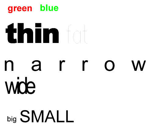
Well, I was wondering what happens if you turn it around: Express the contrary, or something entirely different with the colour, size and shape of a font than the word actually reads.
Testing it myself, I found that the visual level is stronger than the semantic level. So the first thing that comes to my mind when I read the word green in bright red letters is not actually what I read, but what I see: red.
Here are some examples:
posted by nils at 3:55 pm
![]()

0 Comments:
Post a Comment
<< Home