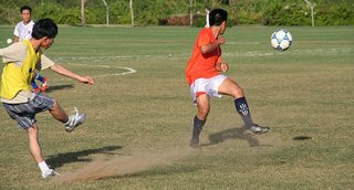
Thursday, November 30, 2006

Full motion

Sport events are great to capture a moments full of motion.
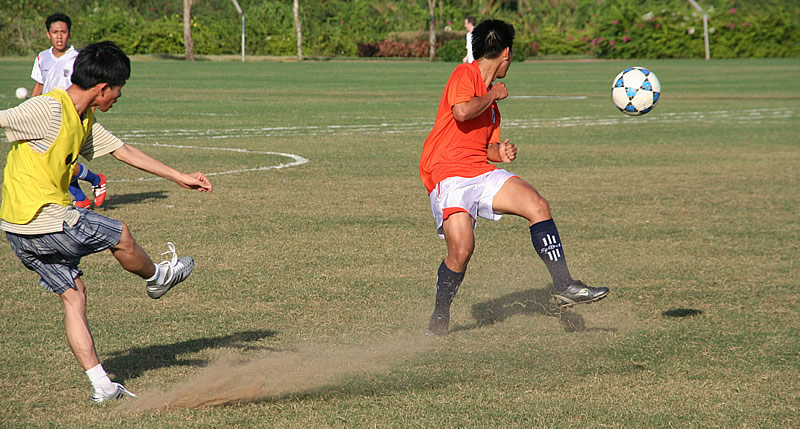
At today's match I played around with very high shutter speeds of 1/16000 and less to freeze such a moment.

I got one image I'm quite satisfied with, you can actually see some details you normally would not notice, such as the raising dust after a strong shot.

I also cropped the image to a stronger landscape format to emphasize the direction everything seems to move.

Header Image - Swiss Club

Some international students think of establishing an international Club at RMIT, which is supported by the Swiss Government I designed a header image for the use on the website.(which still to come)

As the corporate Design of official Swiss information material is quite minimalist, and scarcely uses much colour, mostly grey and black, I tried to transfer that philosophy to my work.

The image in the background is a subtle outline of the Matterhorn, maybe the most famous mountain in Switzerland. I used a rather weak, distorted line to contrast with the strong, upright letters of the text.

Sunday, November 26, 2006

Business Card

As the vietnamese are really fond of exchanging business cards, I had the idea do design one myself.
I wanted the style to match my new website portfolio (see post below), so I used the same colours, fonts and patterns as for the website, and adapted it to the layout of a business card. As I think, it is recognizably my style.


Tuesday, November 21, 2006

Playing with fonts

Typography can be used to effectively underline, emphazise and support the semantic level.

Well, I was wondering what happens if you turn it around: Express the contrary, or something entirely different with the colour, size and shape of a font than the word actually reads.

Testing it myself, I found that the visual level is stronger than the semantic level. So the first thing that comes to my mind when I read the word green in bright red letters is not actually what I read, but what I see: red.

Here are some examples:

Sunday, November 12, 2006

Portfolio Website Design

This is one mockup version of my personal portfolio website.


I have created a fairly simple layout, for a neat, easily navigable page. As you may guess it partly resembles the colours I also used for my blog layout.

I like the light, fresh green , which I think fits well together with black and grey tones. I wanted to give viewers an inviting look and not distract them with too many colours or graphics.

The to the outlines reduced image on the left hand side will be different on every main page and will feature images of famous monuments, buildings, places etc. I photographed during my travels.

The other small picture in the right corner is held in the same style and serves as a closure element on the right hand side, as well as a balance to the bigger one.

Friday, November 03, 2006

Layout excercise

So that’s my attempt to layout the "Secret sex life of plants"

I tried to keep the layout simple, so I just used one image, experimented with more in the lower page, but skipped it eventually

The gestalt concept of continuance is used with the lines to guide the viewer towards the main image.

Closure can be found in the upper left corner, the quarter image of the flower.

As for typography I used the Font Futura, which I think looks quite elegant, still appropriate for the scientific content. Two columns and justification, as often used in magazines make it easy to read.

Don't drink and drive

well, that was the titel that came to my mind after I designed this picture, which was actually my first serious try with a 3-D Program.

Considering the amount of time it takes just to create such simple items as a key and a glas, I am not really sure if I am going to create more 3D-thingies. Still, it is something you cannot do with ordinary programs as photoshop and it's quite fun playing around with different lightsources, mirroring, raytracing...
But anyway...here it comes: